|
MTF and SQFBy Bob AtkinsIntroductionWhen it comes to image quality the lens stands as the first, and possibly most important, link in the chain. Without a sharp lens it’s not possible to get a sharp image. However to determine if a lens is sharp, and how sharp it is, we need some sort of objective scientific test method which we can apply equally to all lenses. The “gold standard” test for many years has been the determination of MTF or Modulation Transfer Function. This sounds complex but really it isn’t. It’s simply a measure of how much of the modulation (contrast) in an object appears in the image of that object as produced by the lens under test. Modulation Transfer Function (MTF)MTF is probably best explained using the image below. At “A” we see a set of patterns of dark and light bars. There are 4 sets of bars at increasing small spacings. At “C” we see a line profile of “A”, which is basically a plot of the intensity across “A” where the white areas have an intensity of 255 and the black areas have an intensity of 0. (255 is the maximum intensity of an 8-bit digital image). At “B” we see what the image of those bars might look like when they are imaged by a lens. The dark and light regions blur, and the closer the spacing they more blurred they become. At “D” we see the line profile and below the plot is the MTF that would be calculated from that data. 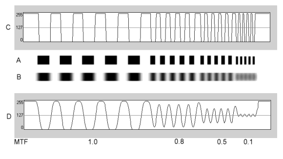 MTF is defined as MTF = (max intensity - min intensity)/(max intensity + min intensity) The important point to note here is that the blurring of the image isn’t necessarily due to any defect in the lens. Even a perfect lens does this because of diffraction. Diffraction is the tendency for light to spread out when forced through an aperture. This results in some of the light from the light areas spreading into the dark areas. When the light and dark areas are large, this doesn’t have a big effect (the MTF is still quite high), but when the dark and light areas are small even a small amount of light spread causes a significant drop in MTF. The result of this is a lowering of the MTF as spatial frequency increases even for a perfect lens. Of course the degree of blurring can be worse in the presence of lens aberrations. “Spatial Frequency” is the scientific term used to describe the spacing of elements in a pattern. Getting technicalStrictly speaking when we speak of the MTF of a lens, we have to define the type of test pattern being used. The best pattern from the viewpoint of strict scientific analysis isn't a step pattern as shown above where the elements are black and white bars. The preferred pattern is called a sine wave pattern where the optical density varies between black and white smoothly and the line profile looks like a sine wave. However such patterns are difficult to make and the image of such patterns is hard to measure by eye, so most often a bar type pattern is used. Bar patterns actually yield a slightly higher MTF measurement than sine wave patterns, but the difference is small. When plotting MTF as a function of the pattern spacing, for a bar pattern the horizontal axis is in units of line pairs per mm while for a sine wave pattern the horizontal axis is in units of cycles per mm, but often this distinction is overlooked. You may see labels such as “lines per mm” or “line pairs/mm”. Note that lines/mm and line pairs/mm are normally the same thing. In the former case you count only the black or white lines. In the latter case you count black/white line pairs. In addition to the type of test pattern, both the light used to illuminate it and the type of detector used to record the image also influence MTF. This is because MTF depends on the wavelength of the light used. Using blue light gives a higher MTF than using red light for example. Normally white light is used, but even then there would be a difference between illumination by daylight and illumination by tungsten light. Tungsten light has a stronger long wavelength component (red light component) than daylight, so MTF measured under tungsten light would be expected to be lower than MTF measured in daylight. The detector can matter because if it's more sensitive to blue light than red light it may yield a higher MTF than if it's more sensitive to red light than blue light. USAF 1951 Test Pattern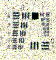
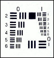 A pattern that has historically been frequently used to make MTF and resolution measurements is the USAF 1951 pattern shown above. It was developed by the US Air Force (in 1951), hence the name! Above on the right is the pattern itself and on the left is an image of the pattern on film. By measuring the results on film you can compare lenses, but you can't easily determin lens MTF since the film will itself limit resolution and lower the system MTF. However you can, with the right equipment, measure the characteristics of the aerial image formed by the lens and thus directly measure the lens MTF. Slit Functions and Fourier TransformsWhile it’s possible to determine MTF by making measurements of the images of line patterns such as those shown above there is a faster and easier way (if you have the necessary equipment). If you look at the image of a very sharp line, typically an illuminated slit, you can mathematically calculate the MTF of the lens. Technically what you’re doing is taking the real part of the Fourier Transform of the Line Spread Function. Sounds complex and it is, but in practice it’s fast and easy to do, and in fact that’s the way Popular Photography tests lenses. Below are examples for a good lens (on the right) and a better lens (on the left). The sharper image of the line produced by the better lens results in a better (higher) calculated MTF 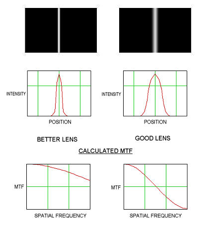
Here’s a typical MTF plot for a lens showing performance for both a real and a “perfect” lens. The blue trace (a perfect lens) might correspond to the “better lens”images on the leftabove, while the red trace (a real lens) might correspond to the “good lens”images on the right. 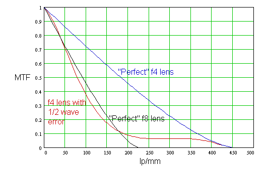 This plot shows MTF decreases as a lens is stopped down and also that lens aberrations reduce MTF. It also shows why a lens often performs best around f8, where aberrations are reduced but diffraction is still not severe. So what do real lenses look like?Real lenses rarely, if ever, come close to the theoretical maximum MTF at apertures below about f8 as stated above, though a few (expensive) lenses may be an exception to this rule. Performance at the maximum theoretical MTF is called "diffraction limited" performance, since diffraction is the reason why MTF falls with increasing spatial frequency, even for a "perfect" lens - thus diffraction ultimately limits the lens' performance. Below is a plot of the MTF of 6 different 50mm camera lenses from a study published in 1960. My guess is that current 50mm lenses are not all that different since 50mm lenses are fairly easy to design and even 40 years ago designs were pretty good.. The scale of the plot needs some explanation. The horizontal axis reads 0 to 1 and this is the "normalized spatial frequency". What this means is that the horizontal axis is different for each aperture. The scale expressed in lp/mm would be from 0 to approximately 1800/f, where f is the f-stop. So for the f2 trace, the scale runs from 0 to 900 lp/mm, for f4 it runs from 0 to 450 lp/mm and for f11 it runs from 0 to 164 lp/mm. By using the normalized spatial frequency you can see how the lenses perform relative to their maximum theoretical performance at each aperture. It's pretty obvious that none of these lenses comes anywhere close to diffraction limited performance wide open, and that most of them will show best results when stopped down to the f5.6 to f8 region. 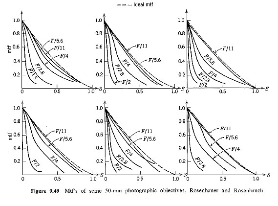 Data from K. Rosenhauer and K.J.
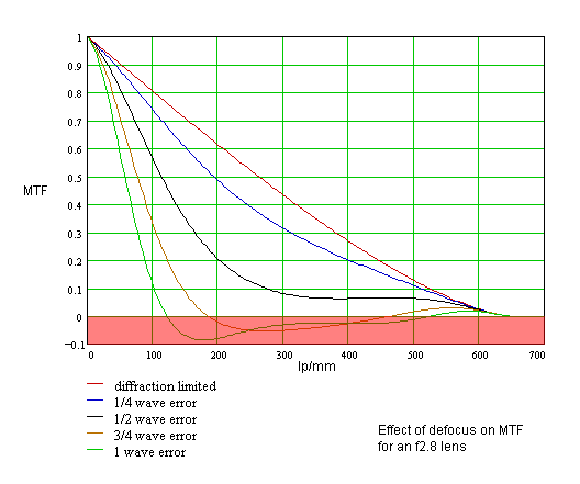
Rosenbruch, Though we normally think of focusing errors as simply "blurring" the image, we can look at the effect of defocus on MTF. Below is a plot showing the MTF of a perfect, diffraction limited, f2.8 lens. Traces are shown for various amounts of defocus (measured in units of wavelengths of wavefront error). Wavefront error is simply a measure of how far the image formation is from perfect. Various aberrations, such as spherical aberration, could also be represented in terms of wavefront error and plots for such aberrations would appear somewhat similar to the traces shown.
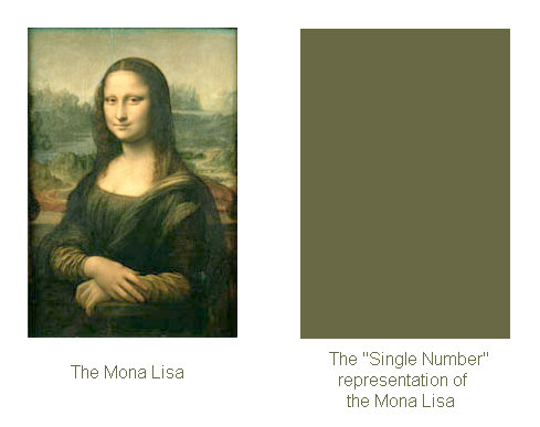
The red region represents an MTF less than zero. In reality what this means is that black areas appear as white and white areas appear as black, so although a pattern may appear to be resolved (insofar as you may see black and white areas), in reality it isn't.Resolution above the point at which the MTF first reaches zero is known as spurious resolution MTF Maps and Single Value "ratings"We've now defined MTF, but realize that we've only defined MTF at a single point in the image. The MTF curve at the center will be normally higher then the curve at the edge, which will itself normally be higher then the curve at the corner. Some authors give an "MTF" value to a lens which is some sort of weighted average across the whole image. While this may have some value, it's about the same as describing the Mona Lisa by it's average color!
Now it's not quite that bad since the MTF "map" will usually be symmetrical and peak in the center of the frame, but a badly assembled lens may well show asymmetric behavior that a single number misses and even if the lens is symmetric a single number doesn't tell you how MTF varies across the frame. A lens with high center MTF and low edge MTF may have the same "average" MTF as a lens that has a medium MTF value all across the frame. MTF is a very powerful measure of lens performance. It can be used, for example, to calculate the effects of defocus or other aberrations on the image. However plots such as the ones above are for a single point in the image. Each point will have its own MTF curve! There’s an alternative way to plot MTF data and that’s to plot MTF at a given spatial frequency as a function of the distance from the center of the image. Such a plot is shown below. The data is for a Canon EF20-35/2.8L lens at 20mm. 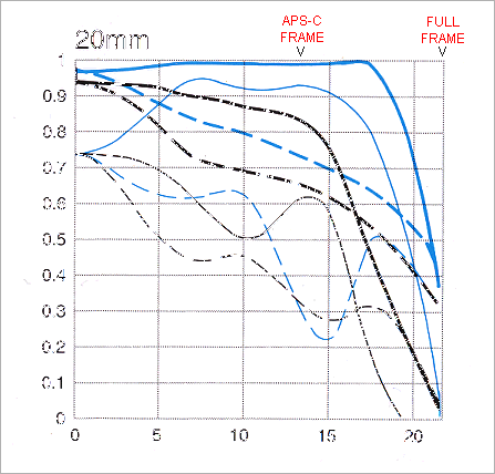
Blue lines are for f8, black lines for f2.8 As you can see, things get quite complicated quite quickly – and this plot only shows data for two apertures at two spatial frequencies and two target orientations (radial and tangential lines). MTF varies significantly across the frame and the lens shows significant astigmatism (difference between radial and tangential MTF). Radial lines are those that point towards the center of the frame, Tangential lines are those at right angles to radial lines. If you think of a spoked wheel with the hub in the center of the frame, the spokes would correspond to radial lines, while the rim of the wheel would be made up of tangential lines. Now take the above plot and try to assign a single number to describe it! One problem with using MTF plots to judge image quality is that it’s very difficult for the average user to correlate MTF plots with image quality. MTF is a purely objective measurement and is ideal for the exact scientific measurement of the optical performance of a lens but it doesn’t take into account any aspects of human vision – which after all is what we use to look at an image – and that’s where SQF comes in. Subjective Quality FactorSQF was developed by Grainger et al in the 1970s [1] to provide a more easily understandable measure of image quality which takes into account not only the intrinsic quality of a lens, but also the nature of how we see things. It has been demonstrated by experiment that human vision has a bandpass characteristic whereby we see some spatial frequencies better than others. Just like a lens, the higher the spatial frequency of the detail we are looking at, the more difficult it is to resolve. However unlike a lens, the human visual system also doesn’t see very low spatial frequencies well. The high frequency falloff is probably due to the optical limitations of the eye’s lens, but the low frequency falloff is due to the physiology of the retina and the way the brain interprets visual information. So the human visual system can be considered to have an “MTF” which peaks as shown below: 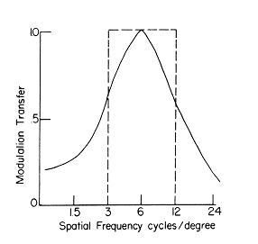 As you can see there is a peak at 6 cycles per degree. This translates to 1 cycle per mm for a print that is viewed at a distance of 34cm (about 13.5”). What this means is that when you view a print from that distance, which would be typical for close viewing, the MTF at around 1 cycle/mm in the print would have the most influence on whether you thought the print was sharp or not. Grainger found that he could correlate the subjective impression of sharpness with the MTF of the spatial frequencies in the print that correspond to the human visual response between 3 and 12 cycles per degree which turns out to befrom 0.5 to 2 cycles per mm in the print when viewed at a distance of 34cm. Grainger then developed a model, which basically states that the subjective sharpness of a print corresponds to the area under the MTF curve between the spatial frequencies of (0.5 x magnification) and (2 x magnification) when spatial frequency is plotted on a logarithmic scale. He verified this model by making prints using optical system with known MTFs and asking viewers to rate the images in terms of sharpness and he found very good agreement between his calculated SQF values and the subjective rating of image quality by viewers. So to give a concrete example, if we make an 8x10 (or 8x12) print from a 35mm negative we have to magnify the negative by a factor of 8 (since the negative is approximately 1” x 1.5”). So as far as the SQF is concerned, the area under the MTF curve of the lens between 4 and 16 cycles/mm is then what really counts. The higher the MTF is in that region, the higher the print quality will appear to be and the higher the SQF will be. 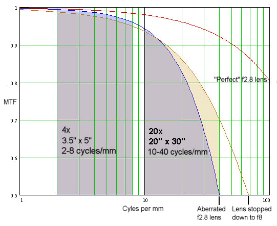 This figure shows how MTF and SQF are related. The MTF is plotted for a “perfect” f2.8 lens (diffraction limited, no aberrations), a real f2.8 lens operating wide open (blue trace) and that same lens stopped down to f8 (brown trace). At f8 this lens isn’t quite perfect (it’s not diffraction limited), but residual aberrations are very small. For a 4x enlargement to a 3.5 x 5 print the SQF is related to the area under the MTF curve as shown on the left. As you can see, the area under the blue curve is very slightly greater than that under the brown curve, though lenses would probably produce an equally good print. That’s reflected in most lens tests where almost all lenses get an A+ rating for 3.5 x 5 prints. The area on the right represents a 10x enlargement to a 10 x 15 print. This time you can see two things. First the shaded area is smaller than that for the 4x print, resulting in a lower SQF. A 10x print won’t look as good as a 4x print. Second you can see that now the lens at f8 has a slight advantage. Prints made with the lens stopped down to f8 will appear sharper. This data also shows something you might not expect, that, on the basis of SQF, it’s possible for lens “A” to be better than lens “B” for small prints, but lens “B” may be better than lens “A” for large prints. Normally this doesn’t happen, but it is possible. It also follows from this that it’s possible that prints from lens “A” may look better than prints from lens “B” when viewed from a distance, but when viewed closely prints from lens “B” may look better than prints from lens “A”! This would be an unusual situation, but it could happen. Interestingly, in the 1980s a Swedish research group showed that subjective image quality could even be predicted from a simpler method that looked only at the MTF at a single spatial frequency rather than over a range of spatial frequencies as Grainger’s model does [2]. However Grainger’s model probably applies to a wider range of lenses with a wider range of aberrations and so may give a more accurate prediction. While we can state SQF to any degree of precision (e.g. 95, 95.1, 95.123 etc.), Grainger found that it really takes about 5 points difference before most viewers notice a difference in image quality. So while most viewers would not notice a difference between images with SQFs of, say, 88 and 90, most would notice a difference between, say, 88 and 93. This is indicated in the Popular Photography lens tests by the different color shading of the SQF values and the A+, A, B+, B etc. ratings which are spaced by 5 SQF units, as shown in the example below. 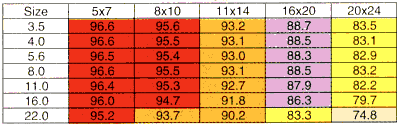
Since SQF is derived from MTF and as we saw earlier every point in an image has its own MTF characteristic, so every point in an image has its own SQF properties. In order for SQF to be useful it needs to address the whole image. To do this, the Popular Photography test splits the image into three regions. The center of the image accounts for 50% of the final SQF. 30% of the final SQF is determined by the SQF at a point 50% way between the center and the corner and 20% of the final SQF is determined by a region 80% of the way to the corner. At each point radial and tangential measurements are averaged. 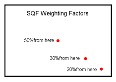 For example suppose we calculate an SQF of 90 in the center, 81 50% of the way to the corner and 60 80% of the way to the corner. The combined SQF would be (90 x 0.5) + (80 x 0.3) + (60 x 0.2) = 81, and that’s the number you’d see in the lens test - 84 Of course you'd also get an SQF score of 81 if the SQF were 81 at all points in the image (81 x 0.5) + (81 x 0.3) + (81 x 0.2) = 81. You still get an 81 with an SQF of 100 at the center, 90 at 50% of the way to the corner and only 5 at 80% of the way to the corner (100 x 0.5) + (90 x 0.3) + (5 x 0.2) = 81. This again shows up the problems of a one number measurement. It doesn't tell you how the image quality is distibuted across the frame.
Whether MTF of SQF is a more useful measure of lens quality depends on who is reading the results. MTF curves are more complex and more difficult to interpret, but they contain more information. The problem is that if you don't understand them, either they are meaningless to you or may even mislead you if you don't know that you don't understand them! SQF on the other hand was designed to be a simple system which anyone can understand. It reduces image quality to a single number again, so it's not (nor is it intended to be) a technical measure of optical quality. It's a number which a typical consumer can use to get some idea of the relative overall quality of images shot with different lenses at different apertures and printed at different sizes. Though it's an objective measurement, it's based on human visual response as well as the intrinic quality of the image formed by the lens, and so may preduct a subjective response to image quality. As single number SQF value is probably more useful than a single number MTF value because it at least factors on the characteristics of human vision. However a detailed MTF plot contains much more information, which will enable a skillful and educated reader to better evaluate a lens. References[1]”An optical merit function (SQF) which correlates with subjective image judgments”, E.M.Grainger and K.N.Cupery, Photographic Science and Engineering, Vol 16, #3, pp221-230 (1972) [2] “Lens performance assessment by image quality criteria”, K. Biedermann and Y. Feng, Image Quality: An Overview, Proc. SPIE Vol. 549, pp36-43 (1 985)
© Copyright Bob Atkins All Rights Reserved |
|