.jpg)
Q65 Sync plot
In the q65 mode of WSJTX 2.4.x, the wide graph (Waterfall) has a spectral display mode called "Q65_sync". Currently ( version -rc1) this cab plot two traces:
(1) A red trace which appears over a small frequency range depends on where you have the Rx frequency set and the Ftol in use.
(2) An orange trace which covers the whole audio bandwidth. This is related to the multiple decode function if WSJTX v2.4.x, where the program can look outside the Rx frequency and Ftol range you have set to find and decode a second signal in the passband. This function will be described elsewhere. Basically where you click to decode a signal you see on the waterfall.
The red trace is a probability plot for location of the sync trace. A oeak in this plot represents what WSJTX thinks might be a probable location of a Q65 sync tone. The orange plot is a signal strength plot of what WSJTX 2.4.x thinks looks like the sync tone of a Q65 signal. This is not probability, it's signal strength and it comes from the averaged data.
Other display mode for the spectral data are signal strength plots of the last decoded segment, whatever the signal is (carrier, Q65, JT65 etc.)
It's easier to see this on screen shots than to try to describe it, so here are some examples. First here's a simple linear average blot of a rather complex set of signals:
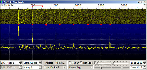
In this spectrum there are 6 q65-60b signals with 20Hz spreading, which decrease in S/N by about 2dB on each step moving from left (700Hz) to right (2200Hz) in 300Hz steps. These are typical of signals you might see on 1296 EME. There's also a plain, unmodulated, unspread, tone at 2500Hz and finally a 100Hz wide carrier spread carrier centered near 2700Hz. The linear average shows all these peaks (though the peak at 2200Hz is very small). It doesn't discriminate between the Q65 sync tones and the unmodulated carriers. They all show up with a height that's proportional to their signal strength (as seen on the waterfall).
Now lets look at a Q65_sync spectrum plot of the same signal after 6dB attenuation
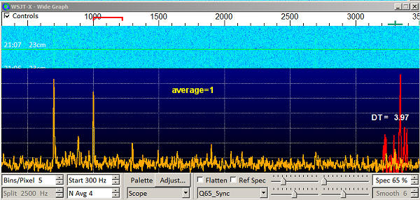
You can see that the first few Q65 sync tones are clearly indicated as peaks in the orange plot, but the plot is a little noisy. Note also that the narrow and spread carrier signals (which do not have the Q65 sync pattern), don't register on this plot. The red curve shows WSJTX trying to find a sync tone near 3300Hz. There is no tone there, though WSJTX 2.4.x produces a peak where at what is presumably (?) the place where it thinks it is most likely to be.
Now let's look at what it looks like after it has accumulated 6 receive periods
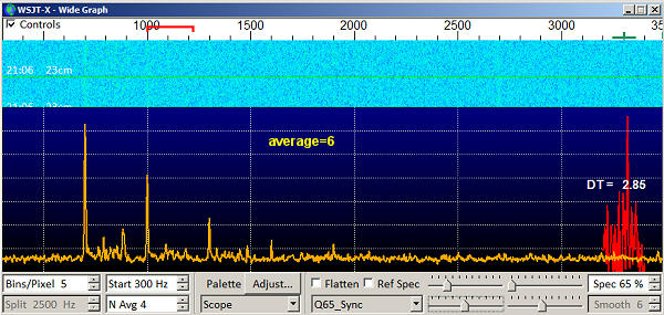
After averaging 6 samples the background noise smoothes out a little and the peaks become easier to see. The first 5 peaks are clear, the 6th peak (at 2200Hz) isn't visible. Note the continuous carriers do not show up, even after averaging. The orange Q65_sync plot is finding only those signals that really look like Q65 sync signals. The red curve is still looking for a sync signal where none exists...
Now lots look at a second set of signals. These are Q65-60D signals with 100Hz Doppler spreading. These might be typical of what you would see on 10Ghz EME. First of all the linear average.
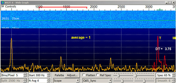
Again I've told the read curve to look for a probable (possible) sync tone around 3300Hz and it's found one, even though none exists.
Averaging 6 periods, the spectrum becomes even more distinct
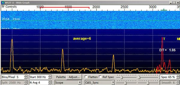
You can see that the orange graph has very clear and distinct peaks at 500, 1400 and 2300Hz. The waterfall really gives little or no indication of a sync trace. In addition the orange peaks clearly show the 500Hz signal is stronger then the 100Hz signal, which in turn is stronger then the 2300Hz signal. The difference between successive peaks is an S.N difference of around 2dB. The red curve again find a peak where non exists. This isn't really fair to the red plot, as ideally you would have it centered on a frequency where you think there is a sync tone, and WSJTX 2.4.x would then attempt to decode that transmission. However just because it shows a beak, doesn't mean it;s actually found a sync tone.
Note the red trace only appears when AP is in operation, i.e. when there are entries in the DxCall and DxGrid boxes.
Bottom line
The orange q65_sync plot is very useful for identifying the presence and position of a sync tone when nothing is visible on the waterfall. If may identify the presence of a signal below the level at which the signal will decode